California Forest Observatory
UX/UI Design Leadership
Product Design
Prototypes
Map Interface Design
OVERVIEW
Collaborating with Presence Product Group, I led and shaped the design direction for Salo Sciences’ California Forest Observatory. Through strategic guidance, product vision, hands-on design work, and the dissemination of best practices in user experience, I worked closely with the founders to drive the project forward.
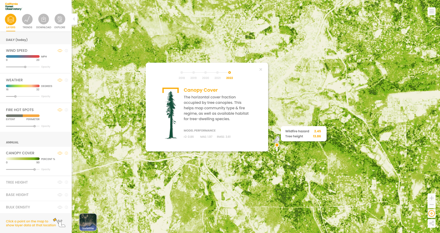
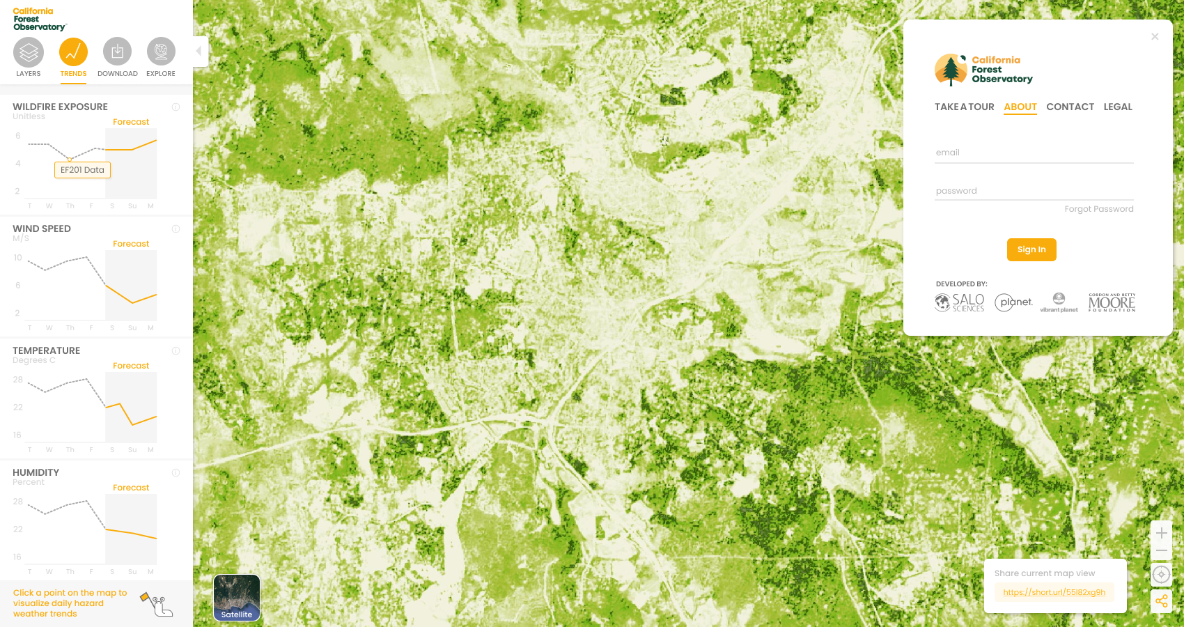
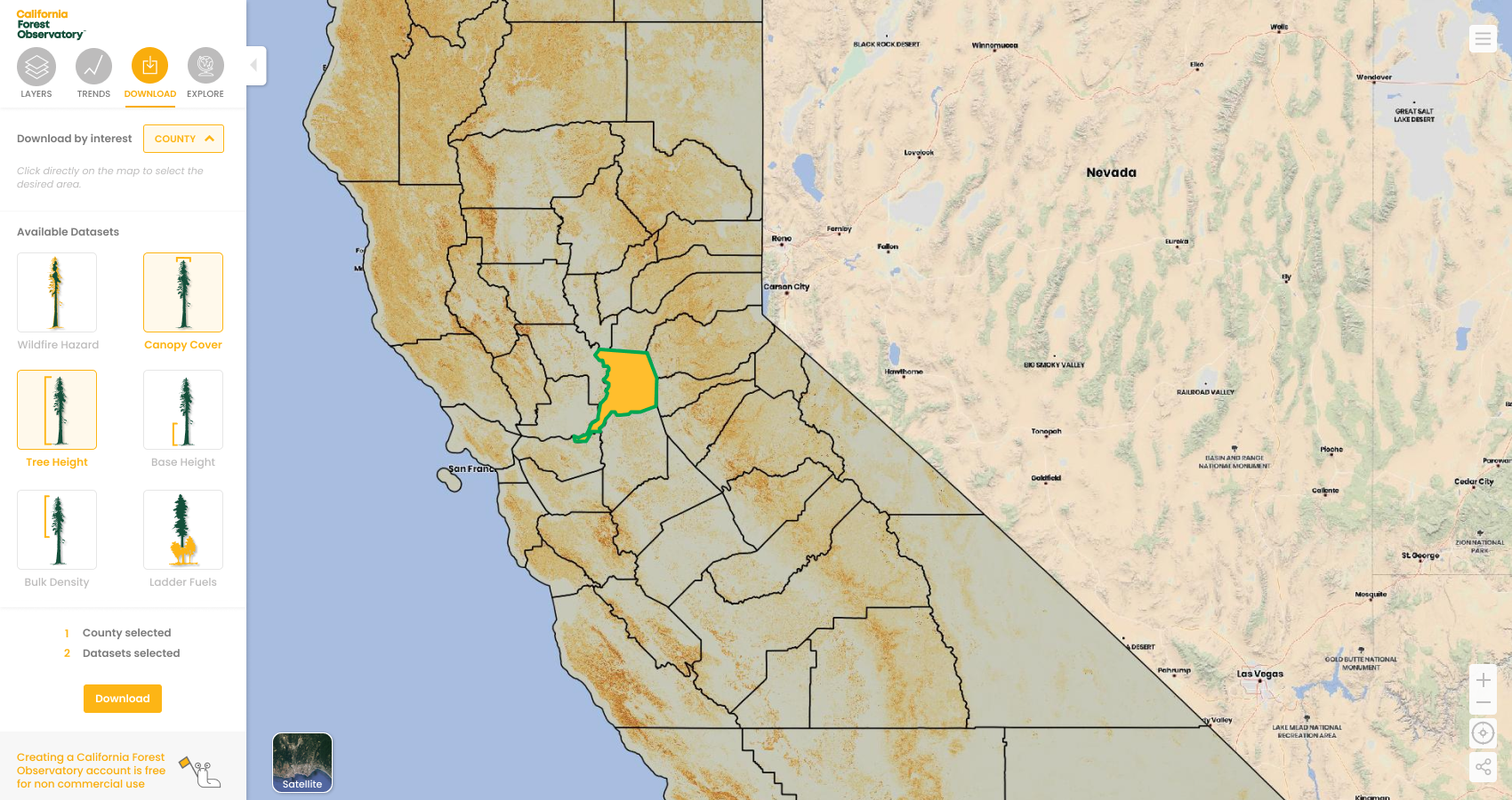
We successful launched a visually striking map interface, enriched with thoughtfully designed geospatial data, informative modules, and intuitive filtering tools. The result was a seamless user experience that facilitated the effortless interpretation of data-rich spatial information.
IN THE MEDIA
Bloomberg’s Tech journalist, Ashlee Vance interviewed the Salo team and created an insightful and educational film about technology and how the team is focused on stopping forest fires from space. You can watch the video here.
Nicola Twilley, a frequent contributor to The New Yorker, wrote an insightful piece entitled “A Trailblazing Plan to Fight California Wildfires.” You can read or listen to the article here.
THE WORK
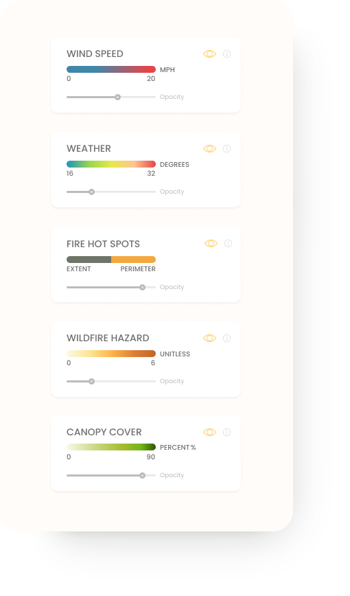
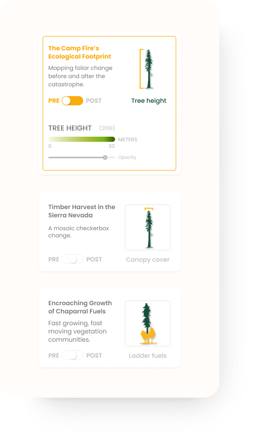
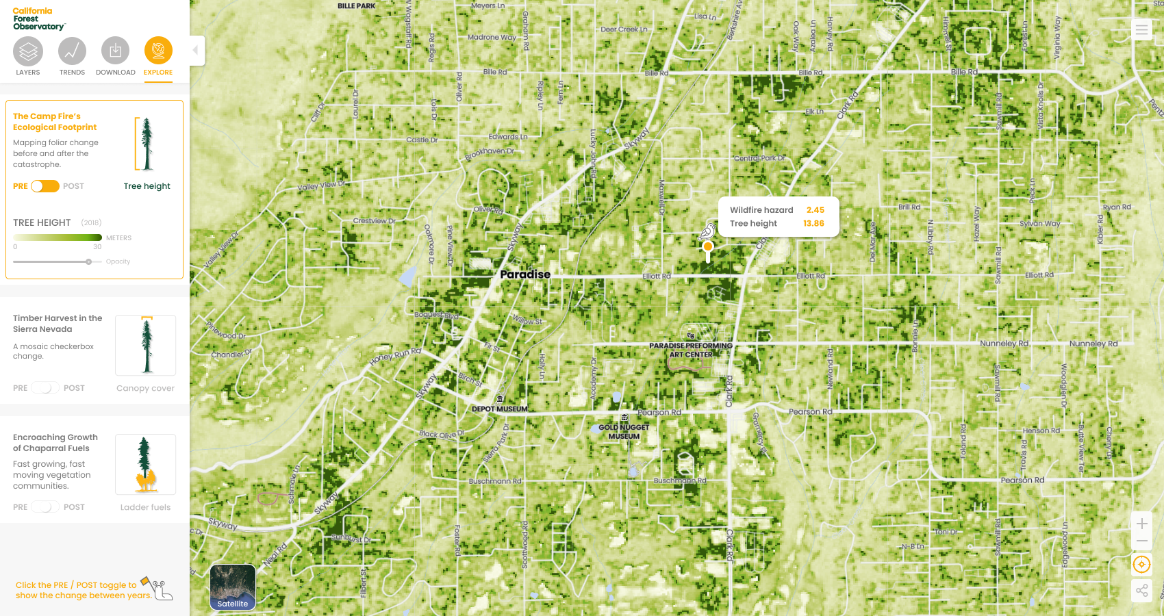
I focused on designing intuitive features that would enable users to easily access and interpret up-to-date information. One of the key challenges was providing users with multiple layer views through toggling and opacity sliders, allowing them to customize their experience and gain deeper insights.
Additionally, it was crucial to fine-tune the overall map coloring system to ensure optimal visual clarity. By adjusting contrasts and exposure levels directly within the map interface, we were able to create a more compelling storytelling experience, effectively conveying critical data points.
WHERE CLIMATE SCIENCE AND DESIGN INTERSECT
In crafting these visual elements, the approach was to modernize geospatial data – the goal was to soften the tool with a sense of non-technical approachability. By pairing color progressions with soft edges and rounded opacity bars, accompanied by generous padding, helped make this science-based-technology-driven-tool feel more approachable.
Central to my design philosophy is the belief that science-based tools should be as engaging and delightful to interact with as some of the most beloved consumer-facing digital products. This perspective guided our efforts to create an experience that not only served its purpose effectively but also resonated with users on a deeper level, fostering a sense of connection and enjoyment throughout their interaction journey.
